Tuesday, 28 April 2015

Clarity Stamp Challenge Wee Folk

Hi, today is my entry for this month's Clarity Stamp Challenge : Wee Folk.

Lots of ideas for this challenge, I love the drawings of Arthur Rackham and the colourful Fairyland lustre ware by Daisy Makeig-Jones of Wedgewood. However, when my new Tree House stamp arrived I ended up going in a completely different direction, inspired by Barbara and using the new letter box set of stamps.

After much consideration I went back to my comfort zone and stamping on card, I thought that my design would work well mounted and framed in the hallway, by the front door, wishing everyone a warm welcome.


Using the new tree house stamp for the fairy and elves wee folk home, not "old folks home" !! The toadstool from an earlier Clarity Stamp workshop. With the Forest Ridge stamped in the background. Masked and inked in hills, Willow and Meadow. A large sun in the sky, Clarity masks are perfect and Clarity stencil brushes to wash over the colour, Butterscotch, Stonewashed and Mountain Rose. I wanted to use Spring colours and a lovely sunny day. The letters for "Welcome" on a banner assembled by the wee folk with some help from a lovely small bird stamp from another earlier workshop. Micron pen string and bow in the trees. There was some foliage to frame the scene. Plenty of colouring in with my Spectrum Noir pencils. The whole card was edged with Antique Linen distress ink and mounted up on a white mat. We have a lovely framing shop locally with plenty of bespoke frames to select from for the finishing touch.

Thank you for visiting and reading about my design.

Kathy xx

Wednesday, 15 April 2015

Waltzingmouse PJ Party

Hi, this is  my card design for the Waltzingmouse PJ Party, bedtime story card design


I used the Nordic Baby set of stamps for the lovely shoes and sentiment, die cuts from Spellbinders and Tattered Lace. The dotty spot background was created using a Stencil/Mask all in shades of pink. Die cut "Baby" spelt out on the cheerful bunting.

I also made a co-ordinating gift tag using the Nordic Baby stamps and Waltzingmouse die cut stitched tags


My final card was using the Nestie friendly, Season's of Love Tags, using the Heart Tag, some Spellbinders Bitty Blossoms, and Sue Wilson Dies for the background all mounted on a scalloped edge card.
I wanted to add some liquid pearl drops around the heart but I need a new bottle so had to give that a miss.


Thank you for visiting and reading my blog

Kathy xx

Sunday, 5 April 2015

Easter Card

Hi, Happy Easter.

This is my card for Artisant Blog Easter Challenge.


Using the colour scheme


I used Waltzingmouse Stamps for the egg basket, and the individual egg and "Happy Easter" sentiment cut out with the matching die cuts, so useful to have those.
The backing paper is one that I have printed from the Tilda World blog, bunnies and colourful eggs, in the perfect colour scheme to suit, just peeping out and heavily distressed at the top of my card. Some Tattered Lace die cuts for the corner, the flower strip and the lace doily behind the egg basket. Then the remaining die cuts are Spellbinders. Egg basket coloured with Spectrum Noir Pens. The darker blue square is distress inks covered with a glimmer mist, which shines in the light. Scalloped edging coloured with distress ink stripes.

Thank you for visiting,

Kathy xx

Saturday, 28 March 2015

By the Light of the Silvery Moon, Jamaica Inn and more


Hi, this is my design for the March Clarity Challenge, Anything but a Card.

This is my first foray into a canvas piece, quite scary at the start, but after getting some grunge paste on and some colour going it started to take shape.

Using Clarity stencils to create my canvas inspired by "Smugglers" there is the sea (a quiet cove), seawall or cliffs and a few fishermans houses topped off with a moody sky and the silvery moon. Various inks were dusted through the ploughed field stencil at the top of the canvas. The sea was added using the Ocean Swirl stencil and grunge paste. The houses were added with extracts of the Town stencil, more grunge paste. The seawall or cliffs were created using the Tangle stencil, yet more grunge paste. Keep washing the excess grunge paste off your stencills before it has a chance to dry on. The moon, which started life as the sun, was added with, yes, more grunge paste through Jo's Bubbles stencil and then it was texturised as the paste was starting to dry.

All this work and yet the only colour was at the top of the canvas through the Ploughed Field stencil. After letting the grunge paste dry, it was time to go in with the acrylics and Clarity brushes. Wow, what fun.
Starting with the gold, dry brush on over the sea, the wall/cliff, and the house walls. Then add some magenta, before the gold has dried to get the blended colours, over the wall/cliff, house walls and roofs. Finally I used the Phthalo Blue, mainly for the sea colouring, added to the house roofs to darken and in the fields in the background behind the houses. There is a lovely path appeared from no where on the right hand side of the canvas just in front of the houses there, fitted the storyline perfectly.

This was when the decision was made about the sky, the "rough plan" was for it to be shades of blue and sun shine ! I wondered if this was a good idea with the sea colour having blue top and bottom ? So rash decision to make the sky darker and the sun would become the moon, yeah. Brushing over the mix of blue and magenta to get the purple effect, did not like how the new moon had turned out, it looked very grubby, covered in the purple colour. Tried the lightening techniques but that just looked as grubby, out with the white acrylic and some punchinella to add some white dots to the moon, big improvement, got a little wild in adding white dots to the canvas in various other places that seemed to benefit from it. (That's what I told myself, anyway). Stand back and assess your creation, still needed some light to lift it. This is where I got out the craft knife, not to cut my canvas up in to pieces, but to scrape off some colour from the grunge paste to add the highlights, this is such fun. Lots of white foamy splashes in the sea and some scratches across the paste. Then further up the wall/cliff to add some highlights, best was on the houses roofs and walls. Finally I had this idea to scrape off colour from the moon, at first I was thinking go for a full moon and take the colour off completely. But I started by making a crescent shape around the edge and loved it. There are crinkles in the moon shape that look like the Man in the Moon face, again appeared from no where. Finally after all the scraping there was some Spectrum Noir pencils to add some shadows around the houses.

Hope that you like it, thank you for visiting, and for all your comments.

Kathy xx

Monday, 16 March 2015

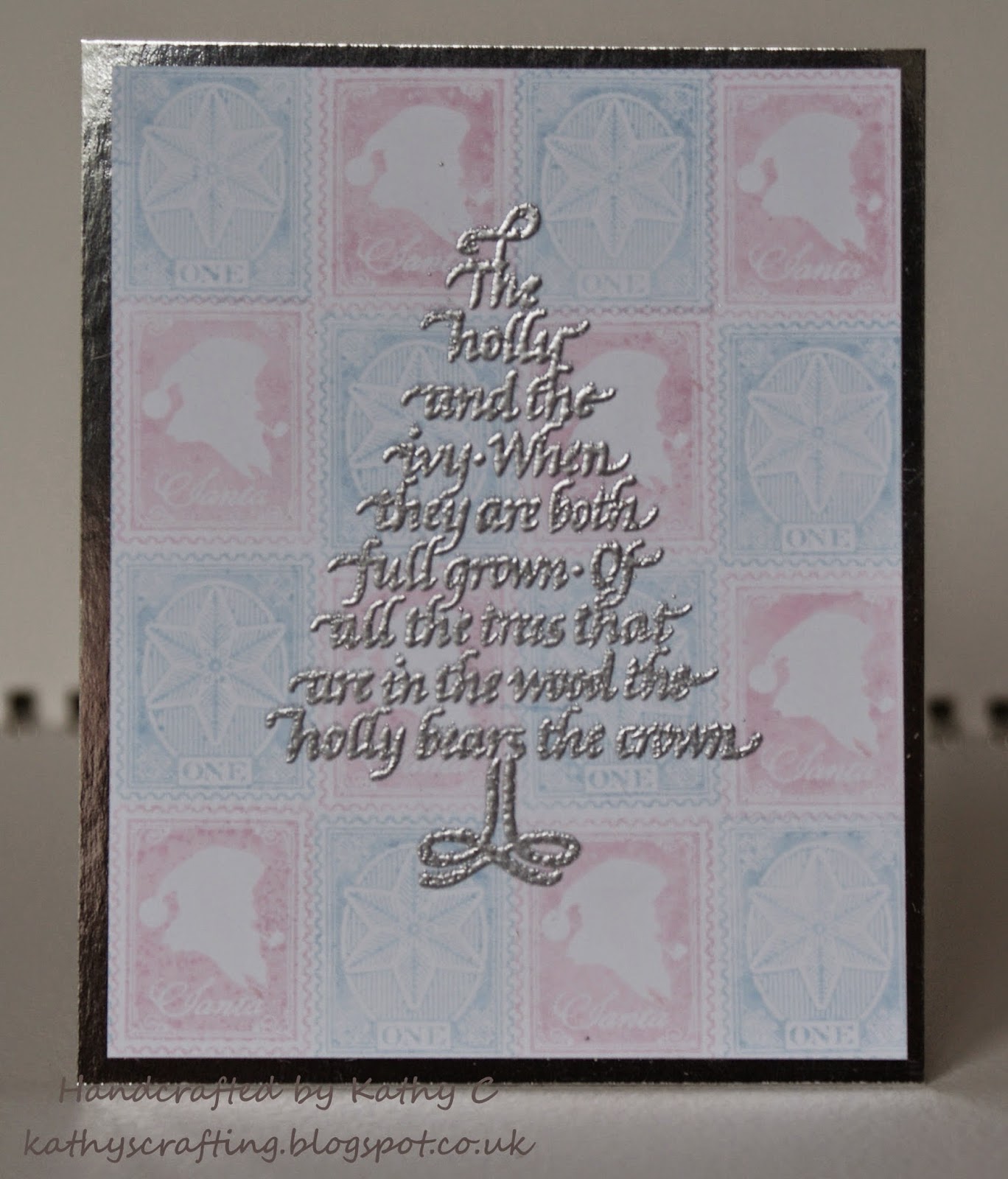
Silver Tree

Hi, this week my card for the 52 {Christmas} Card Throwdown Challenge is a colour challenge,
Pink, Blue  and Silver.


The background is stamped in pink and blue using Waltzingmouse Stamps, Vintage Postcards set a Santa stamp in pink and a Snowflake stamp in blue. Then I have added a Clarity Stamp Christmas Tree stamped and embossed in silver, all mounted up on a silver matt. This is only a small card, at 3 1/2 in x 4 1/4 in in size.

Thank you for visiting and reading about my card

Kathy xx

Thursday, 12 March 2015

Santa Claus Bauble

Hi, this week at 52 {Christmas} Card Throwdown we have a sketch


Here is my interpretation, using Waltzingmouse Stamps for the sentiment and the Santa's Coming to Town, this stamp fits the Spellbinders shape perfectly. Cut, edge with distress inks and matt in red. Topped with a green bakers twine bow and mounted on foam pads. The ribbon is stamped with Clarity Stamps, Holly and Ivy and then coloured with Spectrum Noir Pencils.


Thank you for visiting and reading about my card.

I would like to thank Patricia for pointing out that I was not linking up my challenge entry correctly.
I had not realised that I was making this error. I am so keen to get my next colour card completed so that I can try to get this page linking up right, I hope.

Kathy xx

Thursday, 5 March 2015

Santa's Little Helper

Hi, today my card is for the 52 {Christmas} Card Throwdown Challenge.

This week it is a Stash Challenge using  "Markers"


I pulled out a super stamp set from Waltzingmouse Stamps, "Elf Made"
Stamped and coloured using Spectrum Noir Alcohol Pens, cut out using a Spellbinders Label One, dusted some distress inks and mounted upon an embossed background of snow flakes and snow. All finished with a red matt behind. I added a lovely matching topper from the same stamp set, die cut circle, mounted up on foam pads for some dimension to my card. Written around the edge of the topper is "The best way to spread Christmas cheer is singing loud for all to hear"

Thank you for visiting and reading about my card.

Kathy xx